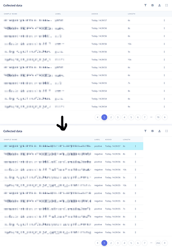
Please fit table columns so more data is visible, not perfect but already better:
(Based on https://stackoverflow.com/questions/31184000/making-a-bootstrap-table-column-fit-to-content)
Good suggestion @joris. Right now everything is set by hand to make sure we don’t lose any information (as some columns can contain a lot of info, e.g. very long filenames in the acquisition screen), but I’ve added it to the backlog so we can see if this has any negative impact on the UX.
