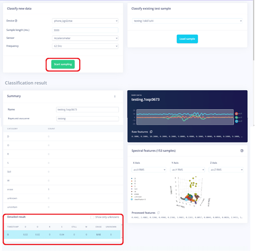
Can you either duplicate the results of the live classification closer to the Start Sampling button or move it to the top? Seems like a minor issue but when you are doing multiple testing the paging down to see the results is quite distracting.
1 Like
Hi @Rocksetta!  Well I wanted to say this thing too…when I am even recording longer lengths of data I have to repeatedly scroll down to see the results , upload thingies and other stuff. Would love to see the results tab to be moved near the top!
1 Like
Thanks both, added to backlog. I think it’s mostly visible when you have a single sample or lots of classes - let’s see if we can make something interesting for that.
2 Likes
