Currently uncertain rows are highlighted. It would be desirable to highlight rows that are classified correctly/incorrectly according to the expected outcome
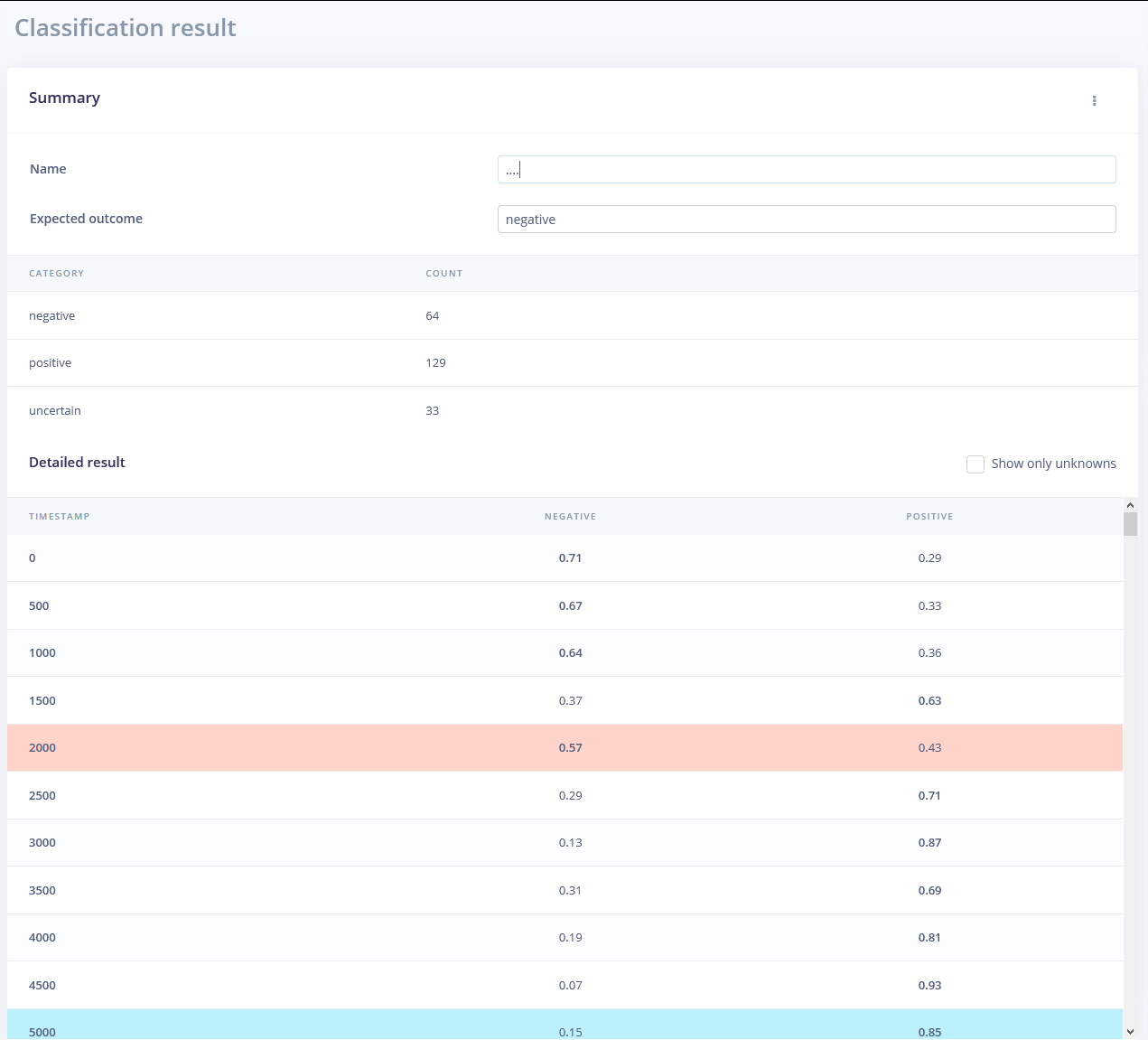
Good suggestion as well - I think it would actually be good to have this as the default, as long as ‘expected outcome’ is one of the labels in your model. Added a ticket.