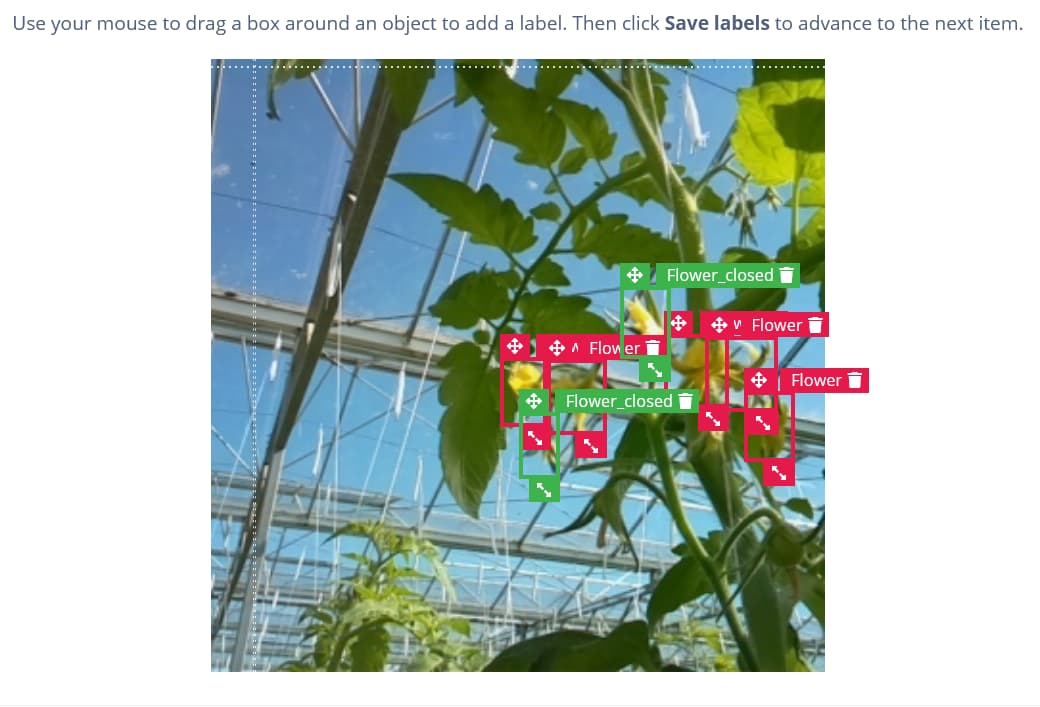
When working on labeling, the bounding boxes and their associated label and icons often obscure close objects making it difficult to accurately set further bounding boxes in close proximity. I often find myself having to shift boxes off objects to give a clearer view, then move them back into position as best I can once I’ve labeled to my satisfaction.
I believe it would be handy if we could toggle the view of bounding boxes on and off (ideally with a keyboard shortcut), so that we can clear the view to label the next object of interest. It might be handy to hide bounding boxes when we start dragging out a new box, but being able to toggle the view would allow users a more accurate starting position.
Please see below for an example of a tight clustering of objects and how difficult it is to differentiate them as bounding boxes are placed.
