Hello,
One of the intermediate steps of creating a model has a “Feature Explorer.” Is there an interpretation or significance of the visualization layers in this graphic or could anyone say how these are generated?
Hello,
One of the intermediate steps of creating a model has a “Feature Explorer.” Is there an interpretation or significance of the visualization layers in this graphic or could anyone say how these are generated?
Hey @Terell_Dale, welcome to the EdgeImpulse community 
This is a brief explanation:
The Feature Explorer layers vary depending on the data input type. A great way to understand this would be accelerometer data.
The studio takes in raw data from the accx, accy, and accz and produces raw features in the form, x1, y1, z1, x2, y2, z2.
-2.7000, -7.0000, 6.5000, -2.6000, -6.8000, 5.8000, -2...
the values of here are sparse, so it undergoes regularisation to reduce weight size and output features look something like this(processed features):
0.8471, 0.4960, 0.6550, 1.9841, 0.3988, 0.0000, 0.0000...
These values are usually between -3 to +3 (Due to Regularisation)
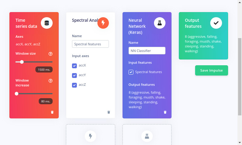
You might have noticed a “window increase” tab in “Create Impulse”
This Input feature block, notes the values of accelerometer data in the allocated window frame, here 1.5s
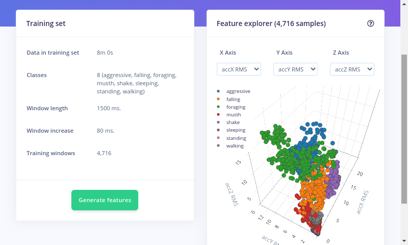
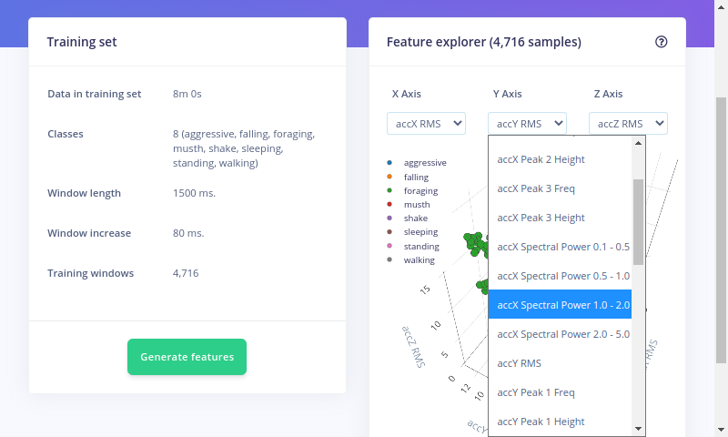
Based on the processed features collected in the given time frame of the label, it assigns the label an X, Y and Z axis.
These features are plotted on a graph on “Feature Explorer”. The graph axes depend on the sensor data, here it is 3.
In the below example, all the features display RMS( Root Mean Sqaured) of the time series of the designated Window Increase.
The Feature Explorer serves importance in recognising the pattern in labelled data and offers a visual approach.
Hope this provides you a jist of what you asked.
Thanks,
Dhruv
@Terell_Dale, and in addition to @dhruvsheth if you have high dimensional data (like audio or images) it’s impractical to plot every single axis (and doesn’t really show you much). In that case we use UMAP as a dimensionality reduction algorithm to reduce the axes to 3 (“Visualization layer 1/2/3”). These axes on itself don’t have any meaning, but serve the same purpose as on low-dimensional data: seeing how well your dataset separates.
Hello.
I am trying to do some real-time classification with images, but I am trying to do it without the prebuilt firmware. I got an example that uses the raw feature array and provides a classification output, but I cannot understand how to generate this raw feature array for every image as I cannot do the copy-pasting while my solution is deployed. Can you guide me?
@TheBluePhoenix somehow you posted 2 years later so that means today is August 7th, 2023!!! Thanks, I just lost a year of my life.
I am not sure why you are trying to use the raw data. You don’t have to go that deep. Please see
@jlutzwpi project Solar Powered TinyML Bird Feeder as a guide.
See here and here .