I just spent last week teaching 80 High School students about using Edge Impulse to train a Machine Learning Model.
Koodos to the Edge Impulse team for making things so easy.
Before I make a video, I often just try things out and see how the students do. A few students never need any help and some students need help with every step, but I am always interested in the issues that come up for the average student.
These two spots confused more than a few kids:
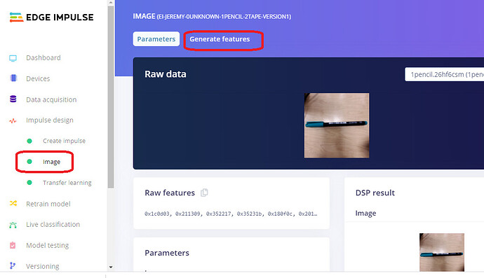
- Impulse Design --> Image. No obvious button to press or thing to do on the Parameters page. To click the “Generate Features” tab before clicking the Generate Features button was not intuitive. Perhaps a “Generate Features” button could be on the “Parameters” tab.
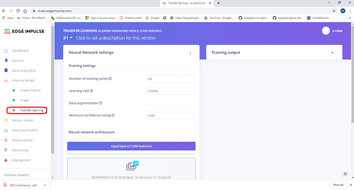
- This one seems picky, but it is never a good idea to overly confuse first time users. On the Impulse Design --> Transfer Learning page, the “Build” button is on the second page. Unseen when a student views the page on full screen. A few students froze and had no idea what to do. Here is what they saw on our school computers on full screen.
I thought I would pass along these minor issues. It was an amazing week to teach Edge Impulse to that many students. The Confusion Matrix and Feature Explorer are the best feedback I am able to give them. A few of my students had Feature Explorer graphs that were much better than anything I have ever made.
I also have my students put their Impulses on a Github web page (Gitpage), but Zack S. convinced me to make a blog out of that, so hopefully that will be coming out soon.

