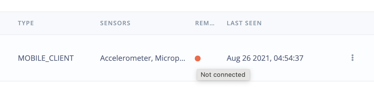
If a device is connected you get a green dot. If the device is not connected you get a red dot.
Be aware that there is something as Deuteranopia (red-green color blindness). Not everyone can distinguish these colors very easy. So maybe make an extra indication (for example by the word active, in case device is connected).
Same remark for feature explorer, where different colors are used. I don’t find any color configuration settings so maybe a nice (future) feature will be a color blind friendly dashboard. This will improve the user experience.
@aurel Thanks for taking this feature request into account.
Not everyone has the reflex to hover over. For the device connection, combining a ‘change in icon’ together with a color change is a simple solution. For example, a little checkbox and a color change.
For the features, I think, it requests some implementation work.
That’s a great point, also in the “Impulse Design” there are a number of steps to complete that may need numbers but perhaps the tick would work here too? “Retrain Model” also has the “fa-circle” and “text-green”.
The replacement suggested would be “fa-check-circle” and “times-circle” for “text-red”.